

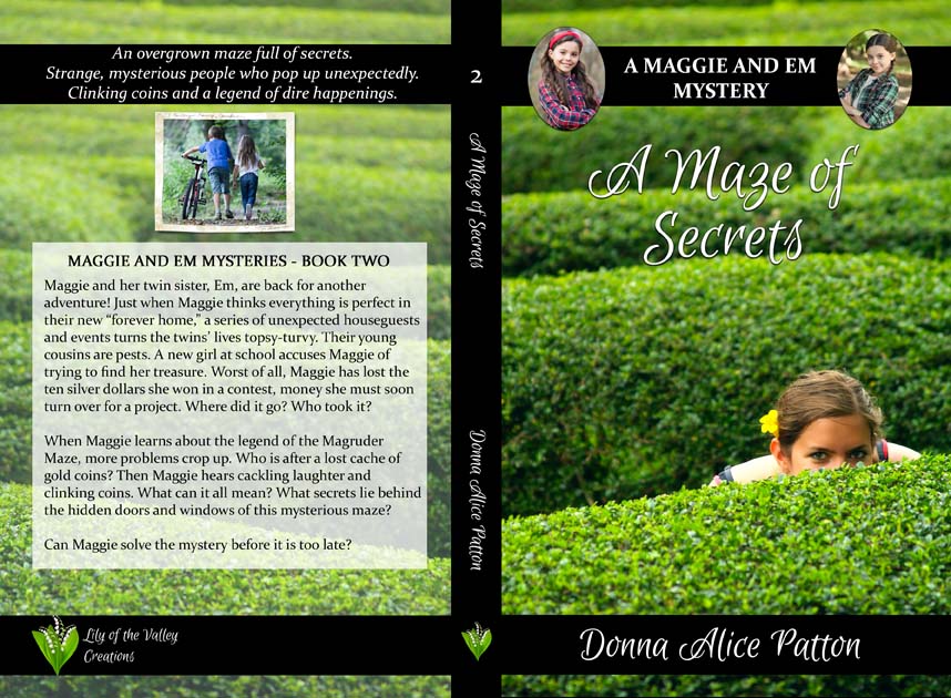
My author friend, Donna Alice Patton, thanks you for your help with choosing a cover for her first Maggie and Em Mystery, The Search for the Madonna (set during the Great Depression of the 1930s). She even has a new website/blog here >> I am her administrator and am helping her set it up. There is not a lot of content yet, but you can go to “books for kids” and read excerpts from the two Maggie and Em books that are up and available for purchase. Here is the final cover. Note: I found better pictures to make the twins look more like different girls. Also, book 2 didn’t need help to decide. She found only one decent picture. But she needs your help with a new book she is writing for this series.

Before you run out and buy the books, I do need to include this important disclaimer: The Maggie and Em Mysteries (as you can probably tell from the title of the first book) include a Catholic worldview. For instance, when Maggie is afraid, she asks the “blessed virgin Mary” to help her, rather than going straight to Jesus Christ. This is a traditional Catholic belief, but as long as you are aware, the mystery is still a fun, wholesome read. The twins get in and out of a lot of exciting trouble, eventually everything works out, and God is over all.
Bottom line. Ask your parents if these books fit in with your family’s worldview before reading them.
Note: For Andi’s Catholic fans/readers, I highly recommend this series.
Vote for Your Favorite Cover
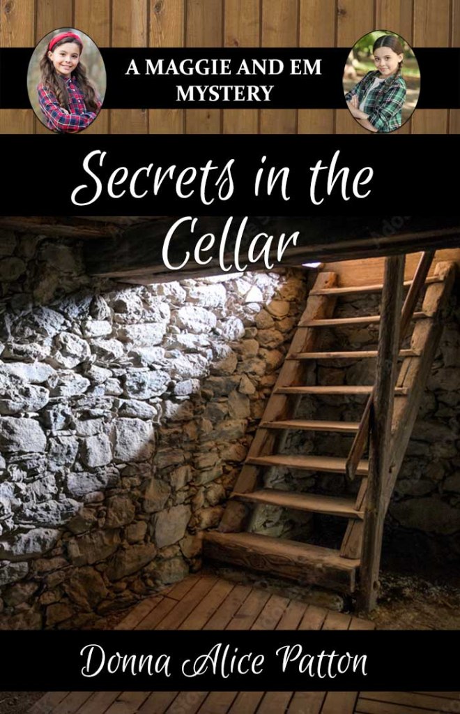
And now . . . it’s time to help Ms. Donna choose a cover for book 3, Secrets in the Cellar. Choose number 1, number 2 (in the middle), or number 3. She thanks you ahead of time, because honestly, we don’t know which one we like best. But you guys never have a problem giving your opinion.


I like number 1 best!
LikeLiked by 1 person
I like number 3 the best!
LikeLiked by 1 person
Does it say where it says is located? The third one looks like it is from the Middle East while the others are normal ones from the USA. I do think though that the 3 one is a little more mysterious!
LikeLiked by 1 person
Ohio. 👌
LikeLiked by 1 person
I definitely like #1 best! It looks mysterious and……cellar-y (is that a word??)
LikeLiked by 1 person
I agree. #1!
LikeLiked by 2 people
I like #1 best because it looks the most mysterious!!
Yeah we are not catholic so i doubt i would ever bye the books but they look good!!
LikeLiked by 1 person
I would have to say #1!
LikeLiked by 1 person
It’s hard to say which one I like more I’ll have to think about it
LikeLike
I like #1 best cause it looks the most like a cellar
LikeLiked by 1 person
I think I like 1 best. It looks mysterious and it looks more like a cellar. The others do too but they look more modern.
LikeLike
No! I mean #1! #3 reminds me of a ship because of the rope railing
LikeLike
No. 1
LikeLike
I think that number one is the best!
LikeLike
I like number 1 the best. I love supporting authors with wholesome content but these don’t look like books for me. Good luck to the author! Her titles sound so mysterious.
LikeLiked by 1 person
#3 is my favourite.
LikeLike
#1 looks the most like a cellar but they would all look great! I also really like the new picture for the girls.
LikeLiked by 1 person
I had to pick No. 3. It look so cool!
LikeLike
I definitely like the picture on #1 best. But I do like the way #2 fades out in a mysterious light:)
LikeLiked by 2 people
I would have to say #1!
LikeLiked by 1 person
are the books written from Maggie’s POV, Em’s, or third person?
LikeLike
The book is third person and from Maggie’s POV. It is but first person. You can go to the website and read and excerpt to see what I mean….
LikeLike
#2 🙂
LikeLike
I like #2 the best, though it seems I am the only one. In #1, I don’t really like the way the boards on the top look with the rest of the picture, and #3 looks too much like a staircase in a castle.
LikeLiked by 1 person
Yes, those boards at the top need to be refined. I just did not think that total black would be good either. Options? I’m open. I’m her cover creator person….
LikeLiked by 1 person
Maybe get rid of the boards, scoot the picture up and add some more black. Or if there is more of the picture at the bottom, add it in instead of black.
LikeLike
The picture is the problem. It’s narrow. So that’s why ask the games I have to play. Maybe something besides weird boards at the top?
LikeLike
You are not the only one who likes #2
LikeLiked by 1 person
Thats exactly what I was thinking!
LikeLike
I think i like No. 1 best. Although I do agree with Anne L. in the top of the picture. I think the black doesn’t even need to be there. But hey! They all look great and blessings to Ms. Donna Patton as she thinks it all out and publishes.
Even though I’m not Catholic, I’m sure I’ll mention them to my mom and we may buy them to help satisfy my thirst for new books! (Not to mention I already own more than two hundred books!) I’m not kidding! 🤣😂😆 Lol!!!
LikeLiked by 3 people
Tho #1 has a darker light
that’s cool, I’m gonna go with #2 because it looks like it has more opportunity for a ‘mystery.’ Idk
Maybe because the flight of stairs are longer?? 😊
LikeLiked by 1 person
I agree!! 🙂 Number one looks cool, but number 2 looks even more mysterious! They both are great options though. Amazing pictures!!
LikeLike
1 is my favorite!
LikeLiked by 1 person
I like number three best. The bright gold colors are beautiful, and really go well with the other books, which look like they have more bright colors on the covers as well.
LikeLike
They are all great, but I like number 1 best.
LikeLiked by 1 person
😬😬😬 I think #3 looks like a ship too…
I like the stonework in #1 but I also like the lighting and long staircase in #2… Is there a way to put the stone walls from #1 into the cover of #2?
LikeLike
Actually, no. Sadly.
LikeLiked by 1 person
😭 Okay, I’ll have to go with… #2. #1 is great, but the wooden boards seem out of place and the ladder too short.
LikeLiked by 2 people
I might be able to extend the ladder with it looking stretched. I’ll experiment. 👀
LikeLiked by 2 people
I like #1 best. #2 has too much light for a mystery novel.
Could you remove the black at the top?
I will recommend these books to my Catholic friend!
LikeLiked by 1 person
1# is the best.
LikeLiked by 1 person
I like #3 the best!
LikeLike
I like #1. The ladder and stones look mysterious and like they could hold endless mysteries and possibilities.
LikeLiked by 1 person
I think #3 is best. But #1 was close for me. Overall I like the ladder and stones in the first one best, but if you want to stick with the feeling of the first two books, then I think the 3rd one is best. It’s all one shade of color, just like the first two books. And it’s much brighter color wise than number one. But they’re both great!
LikeLiked by 1 person
I like number 1 best
LikeLiked by 1 person
If it’s a really old cellar I think #1, It just seams to fit that more than #2 with the metal railing, but I do like how it seems mysterious with the lighting, and #3 looks like it does belong on a ship.
LikeLiked by 1 person
So far if I counted right there are.
#1 -21 votes
#2 – 3
#3 – 7
So it looks like 1 is definitely winning😊
LikeLike
Thx for keeping track. Saves me a ton of work. 😉
LikeLiked by 1 person
Your welcome glad I could help😊
LikeLike
Number one looks like the cellar is empty whereas number 2 doesn’t show what the two are about to get themselves into. So I would say number 2. Plus I think it goes best with the set. Love the new pics of the girls.
LikeLiked by 1 person
I like No.1 the best. But it all depends on the description the book gives you about the cellar.
LikeLiked by 2 people
# 1! 🙂 and will check out the books (although I’m not Catholic 🙂 ) they look super interesting.
LikeLiked by 1 person
#1!
LikeLiked by 1 person
Definitely #1. It is the spookiest.
LikeLike
Definitely #1. It is the spookiest.
LikeLiked by 1 person
#1! I LOVE IT!!
LikeLiked by 1 person
It’s the one I would be most interested in reading (I judge a lot of books by there cover :)).its more suspensive, and cellar’y?
LikeLiked by 1 person
🙂
LikeLiked by 1 person
Now there are
#1 – 26
#2 – 4
#3 – 7
LikeLiked by 1 person
Wow!!!
LikeLiked by 1 person
I like #1
LikeLike
I like #3 the best 🙂
LikeLike
No. 1
LikeLike
although #3 is really cool, #1 has my vote, it looks more like a cellar
LikeLike
So now there are 29 votes for No. 1
6 votes for No. 2
And 9 votes for No. 3
LikeLike
Thanks. I think she will go with #1 but I will work to modify it somehow. 🤪
LikeLike