My publisher had their acquistions meeting yesterday, but I haven’t heard a thing! I did have good news about Christian Book. The Goldtown Adventures series–for the first time ever–was selected to go in their Christmas Fiction 2025 print catalog. With only two pages for middle grade, I feel blessed. Keep scrolling for the read reason for this post.

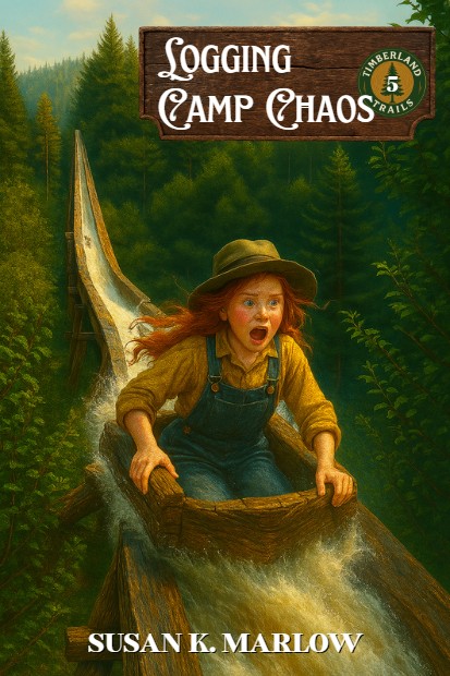
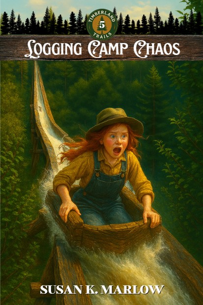
So, I’ve been looking at a lot of middle grade books and I’m finding that the covers are not really photographs any longer. Besides, the photos just have the kids looking at you or looking off camera, and I thought I would like more action. So, I’ve come up with a couple of practice covers. Let me know which one you like . . . then below that, a fun cover for book 5 (but I have NO CLUE what book 5 will be about, but hey, it’s fun to make covers.
So, have at it. Let me know which kind of “banner” you like: the square one in the corner or the narrow one across the top with the forest sillouette.


I really like both, but I think I like the narrow one with the treeline silhouette better! Thank you for sharing!
~Alley C.
LikeLike
I think that the left side looks better, but the right side looks more uniform.
LikeLiked by 1 person
Could you explain what you mean by that? Thx!
LikeLiked by 1 person
I agree. I feel like the left side lets the picture pop and draw interest but the right side is a little more flat and uniform but at the same time, it does unify the different covers with the banner.
LikeLiked by 1 person
I definitely prefer the narrower one that goes across! The book covers are Awesome and I love her horse on the front of Trouble in Tacoma! I’m super excited for this series!!!
Ash H.
LikeLike
I like how the left side has more of the picture in it.
LikeLiked by 1 person
I like the one with the border going across best
LikeLike
Did you use AI on the illustrations?
LikeLike
I think both look great!
Yeah, I was wondering the same thing.
LikeLiked by 1 person
But I edit the illustration in photo shop to make it just right when I need to.
The explosion was not big enough so I enlarged it.
LikeLiked by 2 people
Absolutely! It’s my new friend. 😂
LikeLiked by 1 person
I like type 2 with the title in a bar across the top best. It looks great!
LikeLiked by 1 person
I like the bigger square one best but I do like them both
LikeLiked by 1 person
I like them both, but the one with the silhouette forest kind of threw me off because I thought for a second that the trees were a part of the scene. I go for the one without them. Both are great though!
LikeLiked by 2 people
I like the tree silhouette
LikeLiked by 1 person
This is just my opinion, but I like the banner that goes all the way across. The extra cover looks great too!
Mark L. Redmond
LikeLiked by 2 people
Good for you, Susan. I’m proud of you, seeing your books in CBD. I like the action on your covers, and the banner that goes across the top. I especially enjoy your new book five cover. It should draw attention.
LikeLiked by 1 person
Maybe the tree silhouette one? I like both! I liked your other, non-copilot covers, better, but the copilot cover for book 1 has a fun horse.
LikeLiked by 1 person
I like the banner that goes all the way across!
LikeLiked by 1 person
I think the banner that goes across looks better! It gives the book cover more personality.
LikeLiked by 1 person
They both look great. My eye IS instantly drawn left though… so I’m going to go with the left side. I think it allows the cover picture to pop more and capture peoples interest
LikeLiked by 1 person
The banner with the trees threw me off at first on both of them—the first one looked like there were trees floating in the sky and the second one looked like the trees were part of the background. However, I think the banner has more personality and is cooler. Have you experimented with having the banner at the bottom, like where your name is, instead of at the top? Or have you looked at different styles of banners, like maybe just wood instead of trees?
LikeLiked by 1 person
Oh I can easily take the trees off they’re two separate images. It just seem like the banner by itself was kind of plain
LikeLike
Sometimes simple is best! However I’m sure whatever you decide on will look great 😉
LikeLiked by 1 person
I like the left one for both!
LikeLiked by 1 person
I Like the narrow one across the top with the forest sillouette the best.
LikeLiked by 1 person
I like the narrow one better but both are nice
LikeLiked by 1 person