
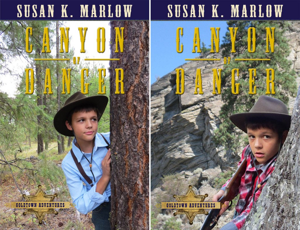
So, Kregel has given the official release date for books 5 and 6. April 16, 2024. They plan to use the cover ideas I came up with (whoo-hoo!), and as the other four books go into reprints, they will update those covers as well. The only concern some had was the “gun” on the cover. Well, it seems to me that the plot starts out with Jem shooting stuff, so why not a rifle? On the other hand, I found another cover which might be just as appealing and it’s also a be brighter. In addition, Jem really does hide with Nathan behind pine trees when they are trying to escape the bad guys, so the cover makes sense. The cover with the tree is the real picture, by the way. No PhotoShopping needed. The one on the right hs been photoshopped with the rock and Jem superimposed on the cliff.
So now I’m torn. Which do you think makes a better cover for Canyon of Danger? Cover 1 – TREE or Cover 2 – GUN?
Also, if you want to read sample chapters of the new books, go to Goldtown >>


I think the Cover 2 – Gun is best! Really cool covers.
LikeLiked by 1 person
I think cover 1 looks better… cover 2 looks a bit photoshopped…
LikeLike
Awesome covers Mrs M!!
and yayyyyyy!!!!!!!! 😀 So happy for you!!!! You finished the last two goldtown books!! *cheering*
I think I like Cover two gun best!! But is is hard to pick!! 😀
LikeLiked by 3 people
I prefer the gun cover-for a few reasons. I think it appears more suspenseful and would appeal more to a boy picking it up to read, as well as looking more like the title suggests (canyon). And I think Jem’s facial expression on the tree cover suggests a fun game of hide and seek vs a dangerous one.
And then I asked my 5 year old boy which he liked better, and he chose the gun one because he likes climbing and the rocks looked fun to climb.
LikeLiked by 4 people
I highly recommend Cover 2. Just for this simple reason that it looks more suspenseful and exciting! And I agree with the above comment, it is among rocks and the title of the book Canyon of Danger!
LikeLiked by 2 people
Cover 2- Gun
LikeLiked by 1 person
Cover two looks best to me.
LikeLiked by 1 person
cover 1-tree
LikeLike
Cover 2 – GUN hands down is the best! it just fits with the name!!! and it looks more exciting and grabbed my attention right away!
LikeLiked by 1 person
I asked my brother and he likes Cover 2!
LikeLike
I think cover 2.😊
LikeLiked by 1 person
Cover 2 – Gun has my vote!
LikeLiked by 1 person
I prefer cover 2
LikeLiked by 1 person
I like cover 2 best
LikeLiked by 1 person
My brother says the one with the gun, since it has the canyon in the back. He says he thinks it looks cooler, and said that the first one doesn’t have a canyon in the background, so he doesn’t think it is as cool.
LikeLiked by 1 person
Cover 2 with the gun.
It fits better with title and the expression on Jem’s face is better in my opinion.😊
LikeLiked by 1 person
I prefer cover 2 .
LikeLike
So exciting!
I think the ‘Gun’ one looks the best! 😀
LikeLiked by 1 person
Cover 2!
LikeLiked by 1 person
Me and my sister both say cover 2!
LikeLiked by 1 person
Cover 2! ^^
LikeLike
We like the tree cover!
LikeLike
I say cover #2!😊
LikeLiked by 1 person
I vote for nbr 2, with the gun! So cool! A cover like that would definitely intrigue my 4 girls. 🙂
LikeLiked by 2 people
I vote for cover 2! 😃
LikeLiked by 1 person
#1, tree. Background not so cluttered,
LikeLike
Cover 2, gun!! Definitely the best!
LikeLike
*scratches head* Hmmm…
well, here are my thoughts in full analysis.
The pros of cover one: not as cluttered, Jem stands out more and doesn’t seem to blend into the background. To me, it draws in my eye. It looks more professional and less… I don’t know… the second one strikes me as clearly photoshopped. Maybe it’s not, but that’s how it strikes me.
The cons: I agree, it does look like he’s just playing hide n’ seek or something. A look of fear on his face would make the cover perfect.
***
The pros of cover two: More suspenseful, would attract more boys since there is a weapon and it looks more dangerous.
The cons: It just… he almost blends in with the background with the gray checks on his shirt. It’s not as visually pleasing as the first one, and immediately I think: photoshop. That’s not a good first thought to have. It just doesn’t look as professional and clean cut to me. My eye is more drawn to the canyon or the tree instead of Jem. My eyes wandered over the background before I actually saw Jem.
I don’t know, just my thoughts.
LikeLiked by 1 person
You need to understand that I photo shopped the gun picture as a cover concept.
My publisher will do the actual professional cover when the time comes. They will do a better job. I just threw it together. I don’t know if it changes your opinion but there you go.
I’m afraid those model pictures were taken 4 years ago. Ask if the Jem Looking Scared pictures looked fake so I can use them.
The gun one does show concern in a natural way.
LikeLike
Ohhh okay. *nods*. I guess I misread that… I would be intrigued to see how the publishers do on cover 2#…
LikeLike
It would probably be the same background and Jem image but they would fix the lighting, etc so it would blend better.
LikeLike
I would recommend #2. It makes it look more suspenseful and draws your eye in.
But I do agree with @Allie Lynn and her thoughts. If Jen had a scared look it would be perfect.
Thanks for giving us the opportunity to vote on the cover! Can’t wait for your two new books to come out!!!!!
LikeLiked by 1 person
Both are nice, but I prefer the second cover. It looks more suspenseful and engaging, which is probably a particular plus for boys. It communicates a sense of action.
LikeLiked by 1 person
I think cover #2 would def be the best cover!
LikeLike
It looks like #2 took it!
LikeLike
So far!
LikeLike
Cover number 2.
LikeLike
Cover 2 – GUN
LikeLike
It was really hard to choose…but I think Gun. I like them both though.
LikeLike
Cover #2, with the gun. The picture on the cover makes more sense going on a book called “CANYON of danger” than the first picture with the tree.
LikeLiked by 1 person
I say cover #2. He’s in a “canyon” and his face says “danger”.
LikeLike
I say totally cover #2. It just grabs my attention right away and in my opinion it fits the book better. Cover #1 looks great and I love it too, but just maybe not for this particular book.
LikeLiked by 1 person
I like them both but Jem is centered and seems more natural in the first one.
LikeLike
Cover 2 – more exciting!
LikeLike
I think cover 2 is better
LikeLike
I cover 2 best it goes with the title well.
LikeLike
Cover 2-Gun for sure:)
LikeLike
I like them both but I think #1-TREE is the best
LikeLike
I’m for cover 2 with the gun. It seems more suspenseful, and the rocks in the back make more sense with the canyon title than the trees do in cover 1.
LikeLiked by 1 person
Cover 2 is my favorite.
LikeLike
I like Cover #2-Gun best. It gives the cover an air of excitement, a hook to make people want to read it.
LikeLike
I think cover #2 matches the title of the book better
LikeLike
I like #2 best it looks way cooler!
LikeLike
I like #2 best it looks way cooler!
~Luca
LikeLike
Sorry I posted the comment from 2 times
LikeLike
Cover #2 – Gun – is my vote!
LikeLike