
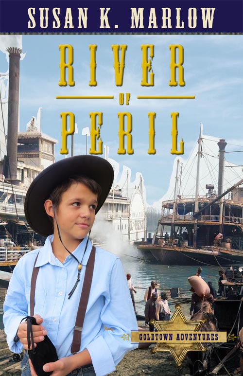
I was trying to think of a way to colorize the photo better, and I went online and there was a free program, black and white to color photo online. So, I uploaded the BW photo and out popped a very nice colored version. The only thing now is to ask my publisher to make the sky a little bluer. Not too much! Just a tad.
So, we threw the modern riverboat out the window (since nobody thinks Jem can walk on water) and instead I took the colorized authentic riverboat picture and did two versions. 1) you can see the gangplank quite well, but the steam is a little distracting. And the colors are not quite as bright, since it’s a white riverboat, more or less. 2) Is more colorful and shows more action on the docks, and the steam went away. But some of you might think it’s too busy. I dunno. Hey, if I knew, I would not have to put it up for yet another vote! Go for it! #1 or #2 and why. THANKS!

I would send along this “blue sky” picture to use as the sky background to keep it from being so pale. The graphic designers there can figure out how to put this into the photo. I did it too, as practice, but it’s way too much work so I left it! But you can see my attempt below.

It was too much work to “cut out” all of the pale sky when I combined the images. WAY too much detail work, but you can get the idea of what it would look like completely finished by professionals (which I am not!) Ignore the ugly pale sky around the smokestacks and the lines. LOL But I think it is coloring up quite nicely–for a cover “concept.”

I think I like Cover#2. I feel like cover #1 is a bit too ‘cluttered’, I love the boats and everything on it but it seems a bit too busy.
#2 seems just about perfect! River, boat, and people, seems about right. 😀
Both look awesome though!!
LikeLiked by 1 person
Also, the color you added looks amazing!!!
LikeLiked by 2 people
#1….the steam is less distracting. Jem looks more part of the pier and the ship stands just a bit out more.
I asked Mommy which one she liked and she said #1.
LikeLiked by 2 people
I would say number 1. 🙂
It looks more realistic. It is more cluttered like Sara said, but I think cluttered (in this case) is better, since I mean, it is a water front and water fronts are more cluttered in real life. 🙂
Both look really good though!! 😀
LikeLiked by 1 person
Definitely, number 1. It looks more real.
LikeLiked by 1 person
I like number 2 best
LikeLiked by 1 person
#2 looks best. I like how they are loading the ship. 🙂
LikeLiked by 2 people
#2 I like best 🙂
LikeLiked by 1 person
I think 2 is best 1 just to distracting for me!
LikeLiked by 2 people
I like Cover #1.
It just looks more appealing to me.
Cover #2 is great too, but it looks like Jem’s shoulder is possibly on fire…and I like #1’s ship better.
LikeLiked by 3 people
The both look great, but as @Lillian Humphrey said, #2 looks like Jem’s shoulder is on fire, and now I can’t un-see it lol! So I vote for #1 ^^
LikeLike
I think #1
LikeLike
I like one, because I prefer the bigger boat behind Jem and the little brown boat next to him.
LikeLike
I like number one since it looks so busy and neat 😉
LikeLiked by 1 person
I like #2 best! It just looks less cluttered and the bigger ship looks nicer next to Jem.
– Luca B.
LikeLike
I asked three of my younger brothers + their friend. two said #1, and two said #2 LOL
LikeLike
It figures! LOL
LikeLiked by 1 person
I vote #1. It just looks a bit more real than #2. Although it is a bit more cluttered, I personally, when I think of a pier think of it as cluttered and always busy.
LikeLike
I flipped the photo around.
LikeLiked by 1 person
Oh, okay. Didn’t see that the first time thanks!
LikeLiked by 1 person
I just noticed that in both pics they have the same boats. LOL
That cook his you did that Mrs. M!
LikeLike
***That’s cool how you did that!
LikeLike
I like number 2 it is not quite so busy 1 is just to busy for me .
LikeLike
#2!
LikeLike
I like #1 best. The steam in #2 is distracting and it does kinda look like Jem’s shoulder is on fire.
I agree with Micaiah. #1 looks a little cluttered but in good way
LikeLiked by 2 people
I like no. 1 best! Though 2 looks really good also!
LikeLiked by 1 person
Which one do you like the best Mrs. M??
LikeLiked by 1 person
Well . . . I like them both for different reasons. That’s why I put it up there. LOL
But if I were one of you guys voting, I would probably vote for #1. I like the “dark” riverboat and the fact that you can actually see that it IS a riverboat. #2 you don’t get to see much of what a riverboat looks like, but I do like the gangplank.
LikeLiked by 3 people
Hey, just wanted to say, A.I. is pretty bad, you shouldn’t mess with it!
I vote for no. 2, thanks!
LikeLike
I’m stumped, actually. So, I found a free online program to upload a BW photo and it changed it into Color. And this is bad . . . how? It’s a tool, just like my PhotoShop. PhotoShop colorizes too, but it did not do as good a job.
The other day, I had to have a CSS code to add a cart to my menu on my website, so I went on line to chat with WP Support. The code came up in ten seconds. Great. A small “answered with A.I.” showed up at the end of the code. Hmmm, so use it? Or I could have shivered, been afraid, and said, “OH, it’s so bad!” Then I would ignore it, wait for 20 minutes for a human support chat, and then get the very same code to plug into my CSS box. Is this even logical? “God has not given us a spirit of fear, but of love . . .”
I would not have this discussion on a public comment except that I did make a grave mistake and I confess it was not wise to title my post in that way. I retitled it but of course, the email notification had already been sent out. Oh. Well.
Believe me, I know ALL about A.I. I read everything. I know it is the pre-planned thing that is being put into place for the tribulation time. But right now, it’s a tool. A machine. Like your phone. Use it for good. Use it for evil. I used it for good. Like I use my electric mixer. Guess I’m secure in my faith that God has everything under control. Even a “scary” new technology called “A.I.”
I’ll probably write a new blog post clearing everything up.
LikeLiked by 1 person
A. I. stands for artificial intelligence, which could easily harm us humans, much more than a phone or electric mixer can. I’m sure you’re aware that this is new stuff that according to some of its makers can “take the place of God” and make humans “useless”. But as we are made in God’s image and have value, we can never be displaced by inadequate artificial intelligence.
Please be careful.
If you know, yourself, that is going to be used against Christians why would you spur on it’s use for convenience now?
LikeLike
Yes, I know what it stands for. It’s just one little cog in the already Christian-hating arsenal. Like I said, I’m not afraid. I am completely aware. I keep up. I’ve lived a long time, my friend. This is not the first time something that is “bad” may wipe all the Christians out. That, sadly, is already happening. It is a tool, like every tool that can be used to promote the gospel or try to defeat the gospel. I just read today how A.I. is going to (possibly) rewrite the Bible into a religious text that everybody will like. And how is that NEW NEWS? Unbelievers have been rewriting the Bible to their own likes since the beginning. Just remember what Jude says in his writing: “contend earnestly for the faith which was once for all delivered to the saints.” No retreat! We press on to hold God’s Word above all.
Thanks!
LikeLiked by 2 people
My husband and I both think that number two has the better eye draw/appeal. (For me the #1 seems weighted to the left side with the lines of the smokestack and Jem’s suspenders all on the left side. )
I definitely like the blue sky addition, and the main thing that would make me lean towards number one would be if you have parts in the book that specify that he’s on a smaller boat/or a brown boat, vs the bigger white one.
LikeLiked by 1 person
I vote for #2. I like them both but #1 is a little busy. That’s cool how you created the covers Mrs. M!❤️
LikeLiked by 1 person
I vote for #1
I asked my 2 younger brothers (without leaning on either side) and they said that they liked #1. 😀
LikeLiked by 1 person
My vote’s on #1. #2 looks a little like Jem’s shoulder is smoking 😀
LikeLiked by 1 person
Yeah!
LikeLike
I like that #2 has more of the riverboat showing, and the gangplank is neat. It also looks less cluttered than #1. Jem’s smoking shoulder is the only problem!
However, his shoulder is smoking in #1, too, it’s just not as obvious.😊
LikeLiked by 1 person
I like the #2 cover the best. Cover #1 looks a little too busy to me. My sister thinks the same, but she likes how you can see the boat better in cover 1.
LikeLiked by 1 person
I say #1. I just prefer the darker cover, especially once the sky is filled in. Which is too bad because I really liked the gangplank. Maybe #2 would be better with the sky darker, but I don’t know, so #1.
LikeLiked by 1 person
That is so cool how you created the covers!
God made some great/smart people to create websites to be able to do that! 🙂
LikeLiked by 1 person
Number 2
LikeLike
I really like the gangplank on number 1, but I think the brown on number 2 looks better. 1 is just a bit too pale with the light blue shirt and all. And I really don’t think number 2 is too busy. It’s realistic, and doesn’t take away from the main focuses (Jem and the steamboat)
LikeLiked by 1 person
Lol, I think you got it backwards.
#1 is the brown boat and#2 is the gangplank
LikeLike
I so for my numbers 1 and 2 I used what you wrote, where you described the gangplank on number one and the darker ship on number two… but the pictures are in the opposite order. So to make sure my vote is clear, I like the cover with the darker ship🤪
LikeLike
Oops! Really!
LikeLike
You are the only one who caught that. I did not even catch that. So funny and good eye!
LikeLike
I prefer #1 because it looks more realistic
LikeLiked by 1 person
I like cover 2 the best! You can see the gangplank leading up to the boat, and more of the actual boat itself. I feel like #1 is a little too busy. The blue sky edited in would do wonders to the overall cover!
LikeLiked by 1 person
I like cover 2 with the gangplank.
LikeLike
I like #2 better. I like how I can see the gangplank and people loading stuff into the boat. #1 is just less appealing to me.
LikeLiked by 1 person
Definitely #1!
Color-wise, in #1, Jem is blocking the non-color parts and the cover shows the colorful steamboat. In #2, Jem is covering the colorful steamboat and showing the dull white one. This makes it stand out (in a bad kind of way) from the other books.
And then in business- I think they both look kinda busy in a good way. Docks are busy, right? 😂 #1 just looks better in my opinion
LikeLiked by 1 person
I like number one best! I love the dark boat and the business! I agree with other people that number two makes it look like Jem’s shoulder is on fire lol
LikeLike
I’ll vote #1, definitely looks waaay less cluttered that two.
LikeLike