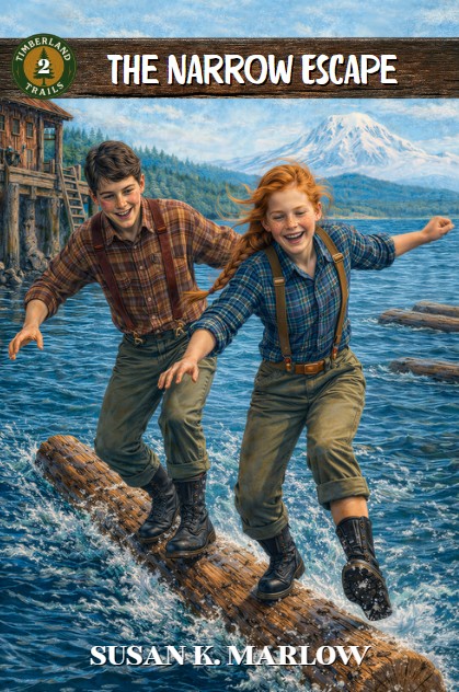
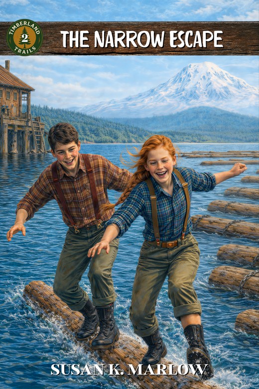
Okay, this is really random. I should be working on book 2, but I got on a “cover thing” yesterday. Now, remember, Kregel will probably not use exactly what I send them, but I want to send them something SO FUN that they might say, “Hey, we can’t get better than this.” LOL
With that in mind, after hours of tweaking and messing around, I came up with these two concepts. They are actually the same image, but one is CLOSE UP and one is a little ZOOMED out in order to see more of the setting. Which do you prefer? Vote in the comments: #1 CLOSE UP and #2 ZOOMED out. And of course add WHY you like the one you do. Then I’ll know which one to send Kregel as a “cover concept.”
If you are on a laptop or tablet, you might be able to see them side-by-side. On a phone, not so much. Let me know! It’s so fun to share with you guys!
#1 Close up
#2 Zoomed out a bit

I really like the #2! I can’t wait to read the books
LikeLiked by 1 person
The second one!!!!♥️♥️
LikeLiked by 1 person
I like #2: Zoomed out because it shows more logs and makes it easier to picture them doing what they’re doing. 🙂 I also like the bigger mountain.
LikeLiked by 1 person
Oh. I just saw that the mountains are two different sizes. LOL Actually, the more accurate is the one with the mountain farther away. But hey. Does it matter than much?
LikeLiked by 1 person
Totally agree, Emmy!!
LikeLiked by 1 person
I like the zoomed out one. The logs in the foreground of the close up one seem a bit distracting.
LikeLiked by 1 person
I think 2# is better because it’s more like a book cover and not so much a painting.
LikeLiked by 1 person
Hi, my name is Parker Allison. I am a huge fan of your books! I can’t wait to read the Timberland Trails! I am writing a book series right now that got inspired from yours! My favorite cover is number #2 I agree with Emmy, Lydia, and Anonymous.
LikeLiked by 1 person
I like #2 better.
LikeLiked by 1 person
They are both great and create interest. In # 1, the young man’s head and arm are a bit lost in the color of the building’s pilings. Not a deal breaker for me. But I like seeing their expressions up close and personal. I agree with Lydia; #2 looks more like a book cover.
LikeLiked by 2 people
#1!
LikeLiked by 1 person
Even though most people seem to like number 2, I like number one because it’s more focused on the characters.
LikeLiked by 1 person
I like it zoomed out! Let’s you see more surroundings!
LikeLiked by 1 person
I like number two zoomed out!! It’s gives more details of the surroundings but still keeps the characters as the main subject.
LikeLiked by 1 person
I like the 2# zoomed out.
LikeLiked by 1 person
I like number 2. The mountain in the background is really pretty.
C
LikeLiked by 1 person
zoomed out!!
LikeLiked by 1 person
I loke both i peronaly dont think it matters all two much but, I think im the odd one out I really like 1
LikeLiked by 1 person
I love #2!! the zoomed out one. it looks cleaner.
LikeLiked by 1 person
I agree; the second one looks cleaner. Also, the characters aren’t as “in your face” and fuzzy like they are in the first one. #2ZOOMED
LikeLiked by 1 person
Definitely 2!!!
LikeLiked by 1 person
I love them both!! But I think number two has got to be my favorite!
LikeLiked by 1 person
I like the second one better because it’s easier to picture the surroundings. Although they are both totally great!
I’m really excited to read them!!
Ash H.
LikeLiked by 1 person
Zoomed out – Maren C.
LikeLiked by 1 person
I like #2 best because I like there being a little more detail to the cover.
LikeLiked by 1 person
I like #2 (zoomed out) better because the mountain seems to stand out more than in #1. Both look great, though!
LikeLiked by 1 person
I like #2 the zoomed out one best
LikeLiked by 1 person
I honestly like #2 best
LikeLiked by 1 person
number #2 is my favorite!!!!!!!
LikeLiked by 1 person
I like #2, the zoomed out cover the best!
LikeLiked by 1 person
I’m so excited for these! They definitely look like they’ll be interesting books! I love Jenny’s personality too!
LikeLiked by 1 person