
I’ve got another cover “vote” for you. Covers 1, 2, 5, and 6 are pretty solid.

It’s just those pesky book 3 (Canyon of Danger) and now (River of Peril). You overwhelmingly chose the RIFLE and ROCK cover, my original. I assure you that Kregel will make it look “not” photoshopped. And I can possibly suggest they center Jem more. But I SO appreciate your voting!
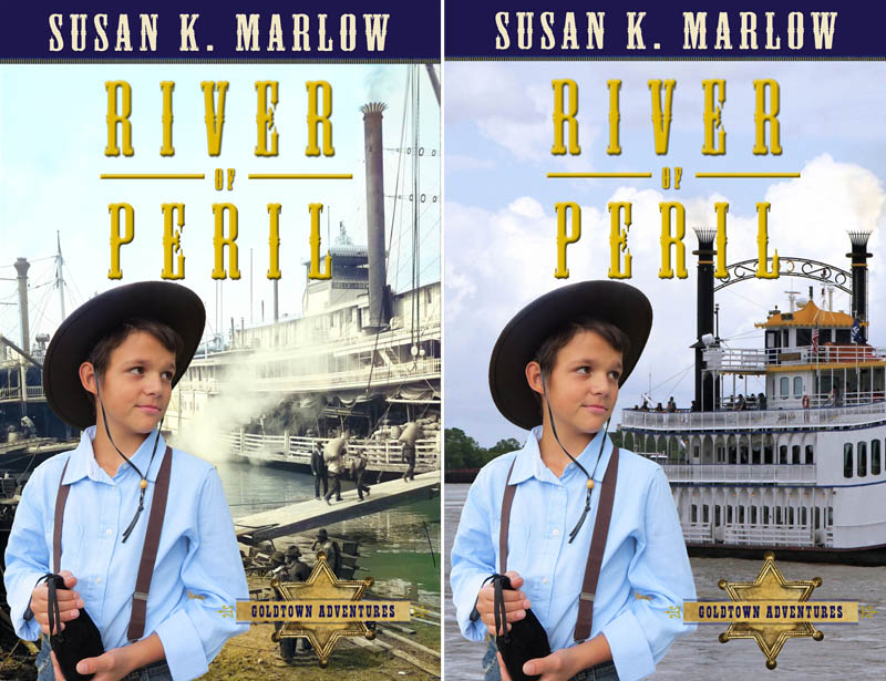
New Voting – Book 4 – River of Peril
The old (original) cover used this picture (very authentic of the river wharf and a sidewheel paddleboat). It worked because all of the covers were colored “denim blue” and sort of faded behind the different Jem pictures. This is a public domain awesome picture of what Jem would have seen at the Sacramento River wharf. I would just slap it on the cover except for one itsy-bitsy problem. It’s black and white. Yeah, doesn’t quite match the rest of the covers’ backgrounds.

I have PhotoShop, so I tried to “play” and colorize the BW image. I was not entirely successful, but I wanted to show you the possibilities. It’s quite possible that Nick (graphic designer at Kregel) could get it fully colorized. But if he cannot, I searched and searched and searched, but there are hardly any paddlewheel boat pictures on the royalty free images that I can buy. So, I did find one (stern wheel, not side wheels) but I covered the paddlewheel up with the picture of Jem.
Voting time! Which do you think makes a better cover? The RIVER FRONT picture (if they can colorize it better), or should I just forget trying to do that and offer them the more modern (although the paddlewheel boat itself looks similar to the 1800s steamboat in the other picture)? So . . . please vote! 1) River Front or 2) Modern boat.
I can’t wait to see what you decide and WHY. I was sure everybody would choose the “tree” picture for Canyon of Danger (you can still vote here >>) since it’s brighter and more natural looking, but I was so wrong! Of course, the rifle was my first suggestion, and I actually had Levi (Jem) model with the rifle for the express purpose of having it appear on the cover. In fact, there would have been no need for a vote if my publisher had not “mentioned” one little concern (the gun). *sigh* I will let my publisher know that the “marketing” survey shows y’all like the rifle picture like about . . . 50 to 2, so there are absolutely no worries about showing a firearm on the cover of a boy’s historical adventure book!


I vote #2. And I asked Mommy what she thought and she said #2.
LikeLike
I vote cover 1
LikeLike
I vote #2. I like the way #1 looks better, but it sticks out among the rest of the covers. #2 fits in with the rest!
My mom also said #2 for the same reason!
LikeLike
Both covers are super good!!
Quite hard to pick… but I think I’ll go with #1.
#2 also looks really good but a bit too ‘modern’ I think. And not as many ‘things’ going on as the first. It’s Jem, a river, a boat, and sky. But…it still looks great!!
#1 has a lot of things going on behind it all. It also seems more like what I would think it actually looks like.
I can see why your having a hard time picking…both look AWESOME!!!! 😀
LikeLiked by 3 people
I vote #2
LikeLike
I vote #2
LikeLike
I vote #1. I think that #2 looks more modern and if you could get the 1st one fully colored it would look really cool
LikeLiked by 1 person
I vote 1 if it’s colored
LikeLiked by 2 people
I vote #1. I think it looks great, even if it stays like that the whole time.
LikeLiked by 4 people
I thing number 1 looks the best. 🙂 The other looks to modern. Also in 2 it looks like Jem is just flouting around in there, while in 1 he looks like he could be standing on the river front. 😀
LikeLike
I like #1 best! It looks more active, while the other one seems . . . less involved. If there could be more color, that’d be great, but I think it looks fine, and slightly less modern.
LikeLiked by 2 people
Hmmmmm that’s pretty hard, I agree with Kayleigh H. but in the end I choose #2, I like the color more. 🙂
LikeLike
#1 I just think it looks more realistic.
LikeLike
#1 if you can get it fully colored!
It looks more realistic and it kinda looks like Jem is walking on water in the second one😊
LikeLiked by 1 person
lol 🙂
I looked again and I now understand what you mean, Jem walking on the water :).
LikeLike
😊
LikeLiked by 1 person
I think #1 looks best!
– Luca B.
LikeLike
#1 looks better imo. (#2 just looks like he is standing in the middle of the lake lol!)
LikeLiked by 1 person
Ya think? Lol
LikeLike
#1 looks better imo. (#2 just looks like he is standing in the middle of the lake lol!)
LikeLike
I like #2
LikeLike
That was a hard choice!
I vote #1.
I think the mixture of black-and-white and color you have there is neat, personally. Also, cover #2 is more similar to Ocean of No Return’s cover.
#1’s setting also looks more perilous than #2’s fancy cruise-like ship. And I agree that it looks more old-fashioned.
LikeLiked by 1 person
I vote #1 if you can get the color a bit better. #2 just seems like something you’d see as a tourist attraction, not something used in the 1800s
LikeLike
I vote #1, because it looks more modern and realistic for the story!
LikeLiked by 1 person
Wow this is very hard!!!
#1 makes Jem look like he’s standing on the shore, but if you think about it, all the other cover pictures look very colorful and “new” in an old-fashioned kind of way. This picture looks like you squished a 1900s picture with a 2000s picture, and it looks kind of odd next to the others. And the coloring might end up looking either really bad or really edited.
#2 does look a bit too modern (and like Jem is standing in the middle of the ocean lol) but i think if you wanted to match the other books well, #2 is your best bet. It is colorful, and you are drawn to the boat in the ocean. Just my rambling thoughts 🙂
I think i’ll have to go with… #2, but it definitely was hard. 🤔
LikeLiked by 2 people
Thanks for your reasoning. It is identical to mine! That is why I put it up for a vote because I see both covers as possibilities!!!
LikeLiked by 2 people
Oh sure!! I want to see both sides of every argument before i make my decision.
LikeLike
Number 2, modern boat! The other one has a background that is too cluttered.
LikeLike
That was really hard to choose… but I think I’d say Cover #1.
LikeLike
#2 – Modern looks cleaner and is less distracting. You can also tell what you’re looking at easier.
LikeLike
I’ll vote cover #2 modern boat, because it doesn’t really look like he belongs on the scene of cover #1, even if it is colored.
and my brother Isaac votes cover #2 as well.
LikeLike
I Vote # 1
LikeLike
I vote cover 1. I agree with the person who said that 2 looks too modern.
LikeLiked by 1 person
I like 1
LikeLike
I thick 1 looks better because 2 looks to modern for me.
LikeLike
I prefer #1 as long as it’s fully coloured
LikeLike
if #1 was fully colored then I would choose that one.
#2 kinda looks like Jim is walking on water 😂
LikeLike
#1-I really like the first picture. Jem looks like he’s really at the river front. The boat’s docked, there’s activity, and it just looks more 1800s.
LikeLiked by 1 person
I asked my brother and he said #2, partly because when compared with the others in the series, number 1 doesn’t quite go as well with the people in the background.
#1 is more 1800’s I reckon, but if it can’t be fully colourized I would definentley go #2
LikeLike
Number 1. Like the extra activity and that it sets it apart more from ocean of no return, like others have mentioned.
LikeLike
I like #1- it looks more old-fashioned, so if it can be fully colorized it would look awesome. 🙂
LikeLike
I vote 1# it exactly how I amagined it and I also think it goes with the story well. I agree with some of the others that cover 2# looks like Jem is standing in the water and is to moden. I personally think it looks more like a building then a ship.
LikeLike
I vote 1# because it’s more interesting and catches you eye more.
LikeLike
#1 because its more interesting and catches your eye more.
LikeLike
I like #1
LikeLike
I vote #1. I think that #2 might be a bit to modern looking for the time period. I also think that while Jem looks like he is possibly standing on the river front in #1, in #2 it might appear that he’s just floating around somewhere in the river. They are both great though, so it will look good no matter which cover gets chosen.
LikeLike
I like #2 best. The colors go well together
LikeLike
I vote #1 for a few reasons-it looks like Jem is standing and watching the boat being readied, and what boy wouldn’t be drawn to the excitement?
The challenges to me for cover #2- it looks as though he’s standing in the water, and while I don’t know the storyline specifically one would imagine that he should be ON the boat rather than at a distance when it’s out on the river. Also, the things on the roof of the wheelhouse in #2 look decidedly modern, as opposed to the clean lines of the older pic when it comes to electronic gadgets.
LikeLiked by 1 person
I vote for the first one.
LikeLike
I think #1 is winning! 🙂
LikeLiked by 1 person
Me too
LikeLike
Cover #1. It looks older.
LikeLike