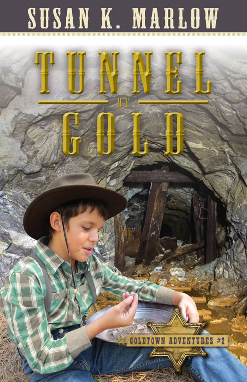
My publisher has been really going to town with redoing the Goldtown Adventures covers. Thanks for letting me know about which cover you preferred. Most seemed to go for cover #1, and here is the final, official cover the cover folks at Kregel sent me just last week. In face, they also redid cover #4, River of Peril, but since there was no reason for voting (since it’s the same cover from before, only I colorized the old BW photo before sending), I never showed you any options. Here are all six book covers. I love how they have now made each border a different color and they also used that color in the “Goldtown Adventures” series name at the bottom of the covers. Thanks so much for all your help. I can’t wait to hold the newly redone books in my hands. I have #3, #5, and #6, but they won’t send me #1, #2, and #4 until the books with the current cover go into their next printing.
Which of these renewed covers is your favorite?


Note: If you look really close at cover #4, I even photoshopped River Duchess on the wheelhouse and you can also see part of the name on the paddlewheel housing.

Here is a collection of a few shots when Levi and I were goofing off during our photo shoot many years ago. Can you just see “Jem” barreling down a gold-miner’s trail on his “quad”? 🤣 In these photos, Levi is the exact age Jem is in books 1-4, twelve and a half. How old do you think Levi is now?


Oooh!! I like cover one – but they are both great!
LikeLike
Ooo I love these!
I have to vote for #1… #2 Jem looks too much out of place. (Could be just me, but I think the words are different on cover two then cover one and the rest) Though I do like the more color on cover two!
Keep up the great work, Mr
LikeLiked by 1 person
Yes! That’s what it is! I feel like the Jem looks a little too pasted in -on cover 2. To me anyway, cover one is more natural looking- the colors compliment each other and the lightings match well together.
LikeLiked by 1 person
The words are different. I have to fake it since they are not created by my publisher (the badge ones. But soon!)
LikeLiked by 1 person
all the covers look amazing!
I’ll have to go with cover 1! It think it looks better next to the other 3 book’s covers. Just like the colours and all go with them better. That’s just my opinion though 🙂
-Luca B
LikeLiked by 2 people
They both look really nice! But I like #1 better! The colors go together really good, and shows a sneak peak of what the story is about!!
I love what you do Mrs. M! Good job!
LikeLiked by 1 person
I have to say I like the colors better in the cover two, and the angle with Jem. The wording on the buildings in cover one looks pasted on. This isn’t going to be much help perhaps, but something that always bugs me just a little is when ‘era’ books use current photos of things that were in the old west…the buildings in Jem’s time wouldn’t look faded and old, they would be brand new practically (not like the crumbling brick building in the second pic). I loved how you used a period pic for the steamboat book, as it was of the proper timeframe!
LikeLike
Good points but… I don’t agree that the buildings looked new, especially with regard to how quickly everything wore out in the weather with nothing to preserve the original colors. So yes…. Things faded very quickly in the Old West, and I think the recreations of Old West towns show this to reflect the true fading and overall dull look on gold rush towns that baked under the sun and faded in the winter rains, and nobody cared…. Too busy looking for gold.
The cities…. Yes. They were no doubt beautiful and colorful…. But not the gold rush towns.
Besides, they burned down regularly…..
LikeLike
I like cover 2 better-the angle looks more natural and the title is easier to read in my opinion.
LikeLiked by 1 person
I’ve got to go with cover #1. I like the nod to the story content in the “sheriff” sign on one of the buildings, and I feel like the buildings look newer in #1 as well. Thanks so much for giving us a chance to weigh in!
LikeLiked by 1 person
I don’t like either of them’ and I like both of them’😂in cover one there’s a building in the background that doesn’t seem to fit. and in cover two there’s a building that says Pony Express neither seem to fit with the timeline, but I don’t know. Maybe they would keep Pony Express up there. I really like the angle of two. so I’ll go with covered two! though I do know that these aren’t exactly how the covers will look when you change them😉
LikeLike
Ooh this is neat! I like cover #1 better, partly because the sheriff’s office is in the background, but also it kind of looks like Jem is sitting in the air on cover #2. 🙂
LikeLike
I like #2!
It seems more vivid, colorful, and interesting.
LikeLike
Cover one!!
LikeLike
cover #1!
LikeLike
Cover #1, definitely. It matches the other covers better I think.
LikeLike
I go with cover 2#
I think it looks more like he’s really there!
LikeLike
I like cover #1 better if you can get the building in the back removed, Susan. I think the sheriff’s office gives more of a western town look than cove # 2 does. The other covers look great!
Mark
LikeLiked by 1 person
I never thought about Photoshopping that out of there.
LikeLike
Let’s see, if Jem, and Levi are the same age, and Jem was twelve in 1864, then Levi is one hundred seventy-two (jk)
LikeLike
Yep. 😉
LikeLike
I like cover #1 better, because the colors go well together and (this might sound silly) but because of the clear sky. Jem is wearing a rather carefree grin which goes well with cover #1’s blue sky compared with cover #2’s grey clouds.
LikeLike
I would have to go with cover #2. I know it sounds silly, but I really like how there are old looking stairs and the faded telegraph sign on the balcony in cover #2. It looks older and I think fits the time period better. Also, I love the false fronts!
-Emma M.
LikeLike
I think cover one is better
LikeLike
Cover #2, since the red buildings and Jem’s red-checkered shirt compliment each other. It also gives the cover a warmer, more welcoming feel.
That’s my opinion, at least : )
LikeLike
I prefer the first one!
LikeLiked by 1 person
I like the colors and the overall look of the buildings in #1, but I like the angle better in #2. In #1 my eye is drawn toward the background; in #2 my eye is drawn toward Jem.
LikeLike
I’m going with the number two…mind you I am looking at it in black and white…to me the second one’s back ground seemed more…real.
LikeLike
I like cover one better, because the angle of the buildings looks more clear, and western. But either one looks good!
LikeLike
number one
LikeLike
I like cover two. The angle adds more element to the cover and makes me feel as if I’m there gazing down the street.
LikeLike
Number 1. I like the ‘Sheriff’ building in Number one.
LikeLike
Everything seems in really good focus on cover #2, rather seems a little blurry on cover #1.
But I like cover #1 more.
LikeLike
I definitely feel like I’m in the town when I look at cover #2, not just looking at a picture.
LikeLike
the picture of the horse on cover #2 makes me think of a kids cartoon movie like Spirit Riding Free or something
LikeLike
I like the sheriffs building in #1 but, all in all, I think I like cover #2 better.
LikeLike
Is Levi 23 or 24 now?
LikeLike
Levi is 17
LikeLike
I’d definitely have to go with #1. The colours are so much cooler. Jem is positioned well on the first cover and in the second looks too fake in my opinion. Very nice though Mrs. M!!
LikeLike
Mmmm….that is so hard, both of them look so good!😃 But I’m going with 1#!
LikeLiked by 1 person
I think Canyon of Danger is my favourite out of all the new covers, but they all look great, Mrs. M!
LikeLiked by 1 person
I like the Ocean of no escape best, but they are all amazing!
LikeLiked by 1 person