This has been a lot of fun, and since it went so fast, we can get on with the final head-to-head voting. I saw that most of you (but not all, I know!) settled on the barn in the background (and it does look more western) and the gold (which does look more western). And it’s not the same gold as Dangerous Decision, I assure you. It’s very hard to take the official template from Kregel and photo shop it to try and find a decent color. My “hue” slider is limited, sadly. But Dangerous Decision is a much darker gold. Also, a lot of you liked number 1, but since the setting was outside, maybe you went with the inside barn setting because of that and so chose the original “gold 2.” So, now you get the chance to choose ONE MORE TIME.
All three are gold covers. All have the barn setting. Now, which one?
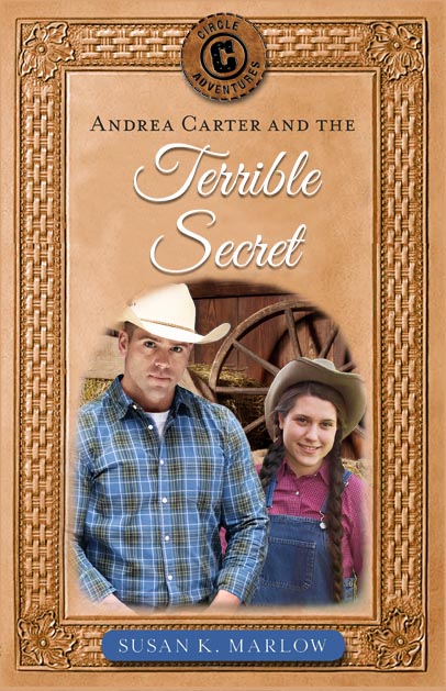
- Andi peeking out from behind Justin/Chad? (the most natural looking one)
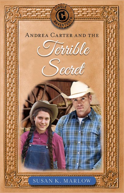
- Andi in front of Justin/Chad? (I had to play around to make this one work)
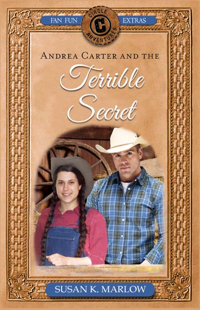
- Andi in front of Justin/Chad and leaning on a wooden ledge in the barn?
They have their pros and cons. You can see more of Andi in #2 and #3, but Andi looks more “natural” in #1. Also, it was hard to remove those “light” stripes from the original Andi in the barn photo so it doesn’t look as natural.
On Friday I’ll share the BCC (back cover copy) along with the final cover!
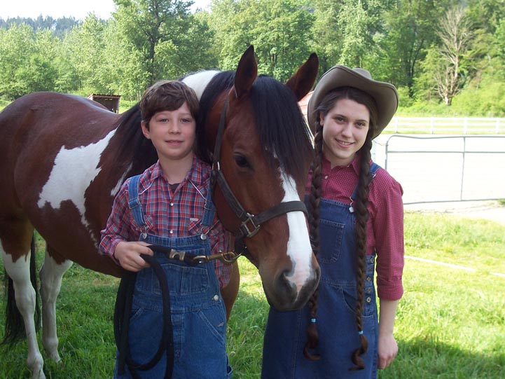
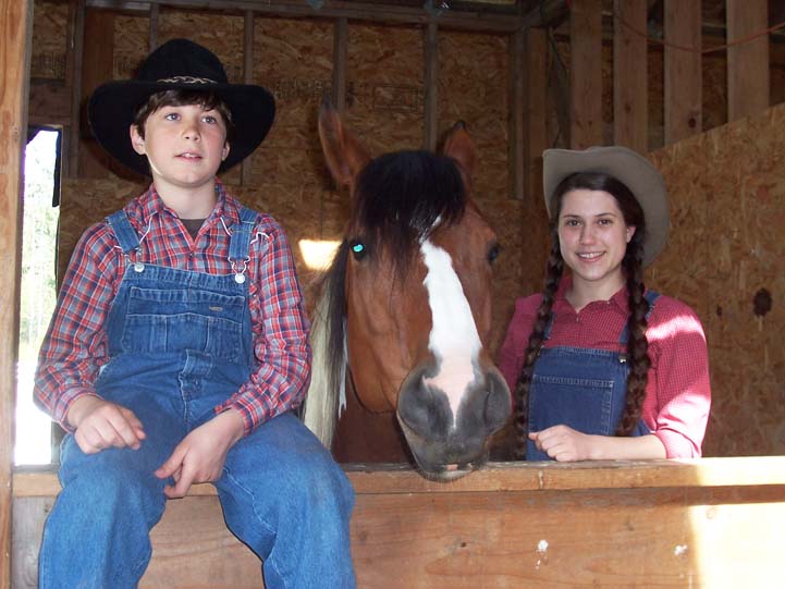
To see what I am up against, here is the original Andi picture that I have used in #1 and #2. You can see the horse cut off her whole left side. I patched it from other pictures to give her most of her overalls, but the arm is very difficult to fake.
Next to the first picture is the original Andi picture I used for #3. You can see I have a lot of issues to overcome! See the stripes? Now you know why they are there. The sun is shining into this half-finished barn.

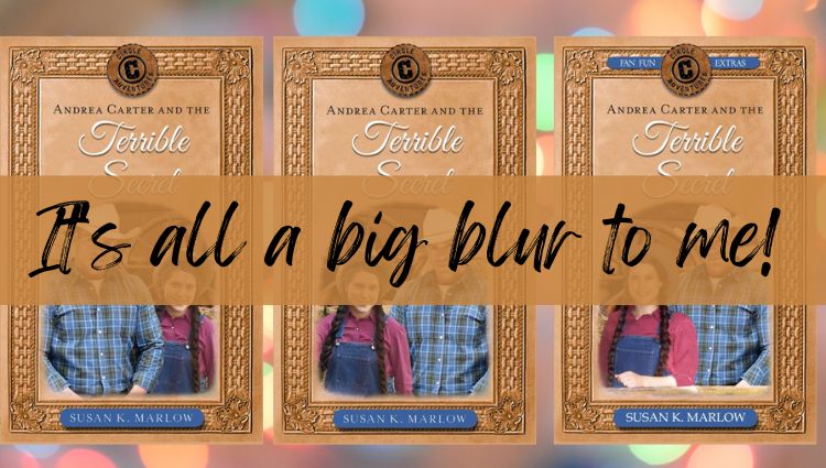
2!
LikeLike
Good afternoon!
All very nice covers. Number three still has our vote!
LikeLike
That’s what my author friends says too. But we’ll see how it goes. It’s a nice bright one.
LikeLike
3
LikeLike
I think I like #1 the best!! I love voting for things like this haha!
LikeLike
I think #2 is my favourite
LikeLike
#3 has my vote!
LikeLike
#1 is my favorite!
LikeLike
I really like #1!!!!
It looks way more natural..
So #1 for me!!
LikeLike
I vote #1! They all look nice, but #1 is more natural. I think how Andi is portioned doesn’t look natural in #3.
#1 is my first vote. But also #2 is good too. But I’m voting for #1.
LikeLike
I vote 1
LikeLike
Number two is my favorite – they are all great though!
LikeLike
I like the middle one!
LikeLike
3
LikeLike
2! I think it looks best cause you can see all of Andi. She’s the main character, so it makes sense
LikeLike
I saved up all the votes from the earlier post More Voting, here is the ones I have!
More Voting.
New Justin and Andi (Gold 1#) – 5
Original Justin and Andi (Dark lavender) – 2
New Justin and Andi (Turquoise) – 2
New Justin and Andi (Gold 2#) – 20
New Justin and Andi (Red) – 0
New Justin and Andi (Rusty orange) – 1
LikeLiked by 1 person
Saving me time! So I did it right for the final post. The top 2 with one a new twist
LikeLike
No problem! Can’t wait to see what cover gets picked! 🙂
LikeLike
I like #3 🙂
LikeLike
2# has my vote. Love the barn in the back😊.
LikeLike
I’m torn between #1 and #2. Andi looks better in front of Justin, but she also looks better when she’s to the right of the cover. It would be soooooo great if you could put Andi in front of Justin on #1!
LikeLike
Yes, see other comment. I’m going to give it a whirl. LOL
But a lot of voters still like #3 best. *sigh* It’s going to be hard cuz I like them both!
LikeLike
#3
LikeLike
I like the third one. I like how Andi looks and I like that the guy is behind her. I think it makes it looks more like the Andi is the mane character how she in in front of the guy.
LikeLike
*looks more like Andi is
LikeLike
I updated the post with the original pictures so you can see what I’m dealing with here. 🙂
LikeLike
My crew and I have 2 votes for 2 and 2 votes for 3. 1 voter says I don’t see a difference in any of the photos.
LikeLike
That’s hilarious @beancakemom. Glad to hear they’ll like no matter what I pick. Lol which do you like?
LikeLiked by 1 person
I like 3 the most
LikeLike
#3! It looks most natural.
LikeLike
#2!
LikeLike
#3! They are all AMAZING but that’s my favorite. I also like #1.
LikeLike
I vote 2
LikeLike
#3
LikeLike
I like #1 the best.
LikeLike
I like 3 it looks really nice Great job at doing these covers I would’ve never imagined that you took it from a different picture and just cut a bunch of stuff out!
LikeLike
Well, cutting it out was only the first step. Lol
LikeLiked by 1 person
Yeah I know there’s a lot more involved with it and it probably took you a while to do
LikeLike
Oh yes! Hours!! When I should actually be working on the story, ya know??? Lol
LikeLike
Ill choose #2! I like the “fan fun extras” at the top too!
LikeLike
I vote for 1! I like how Andi is standing in that one the best.
LikeLike
Good job, Mrs M! I think I’ll go with #2.
LikeLike
Definitely #3.
LikeLike
#2!
LikeLike
#1 or #2 definitely not #3, it looks the least natural to me. I agree that #1 looks most natural! But I like #2 as well!
LikeLiked by 1 person
I’d go #2!
LikeLike
I think I like #2 the best 🙂
LikeLike
#3!
LikeLike
#2 looks the best to me. In #3 I was distracted by Andi’s arm/hand and I feel she isn’t bright enough compared to Chad. #1 is good too, but I like her in front best.
LikeLiked by 1 person
I agree. And in #3, the lighting on Andi’s face looks a bit funny.
LikeLiked by 1 person
I fixed the lightning on the one I have on my laptop
LikeLiked by 1 person
I just meant that her face looks kinda shiny…
LikeLike
Yes, I thought so too so I toned it down. It looks better now. I’ll replace the one here when I have time.
LikeLike
I like #3 the best! Thanks for letting all the Andi fans do this Mrs.M!😊
LikeLike
Oh, hard choice! Wow! You do an amazing job editing those pics into cover.
I think I chose…#2.
All three are great.
LikeLike
I have to say number 3 but I honestly like the other Justin Better
LikeLike
I think you’re the only one. 😂 But clearly I picked him originally as the best I could do and liked him “ok.”
LikeLike
#3! I Like Andi
LikeLike
Ooh . . . I had a hard time choosing between #1 and #2, but I’m going to say #2.
LikeLike
Good Job Mrs. M. I think out of those four I like #3 the best
LikeLike
I think number 2
LikeLike
I like number 3.
LikeLike
I like second one!
LikeLike
I think I definitely like number 3 the best, although I like all of them : )
LikeLike