Find more Photo Fridays in Andi’s Attic >>
My author friend, Donna, is an Andi fan, a great writer herself, and also helps judge our various contests. The rights to one of her kids’ series was returned and she wants to publish the books up on Amazon. I am helping her edit and designing the covers. Donna writes primarily for the Catholic homeschool market, but her mystery books are really good, even if you are not Catholic. She wrote Andi’s Christmas Mystery one year when I needed a Christmas story.
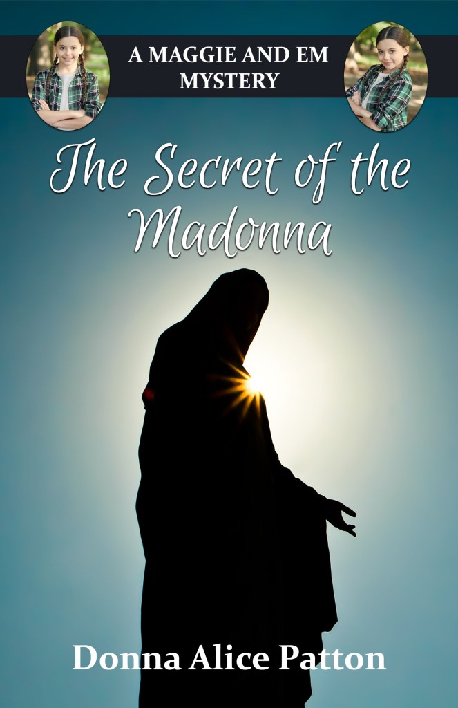
Anyway, friends, you know what we need, don’t you? We need you to vote on which cover “pops” for you. I created cover #1, which Donna loves, but then when I created cover #2, I liked the colors, so now she doesn’t know which one to choose! So, she was excited to let you guys give her a hand. Which cover do you like best? Cover #1 (Dark) or Cover #2 (Gold) Leave your vote and why you prefer it in the comments below, and let’s help out an author who faithfully helps me judge my contests every time I ask her.
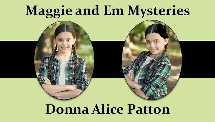
Maggie and Em are eleven-year-old identical twin girls living during the depression. They solve mysteries. Book 1 is about a treasure hidden away and they are determined to find it, so Papa doesn’t have to keep traveling and looking for work. The girls want to settle down and live in one place.


Ohhhh… Both are great but I think I like Cover #1 Better so yeah!!
LikeLiked by 2 people
#1 Dark looks much more mysterious. An idea is to put the girls on the front cover in different hairdos/clothes. So then they look more like twins and not the same person, but this is of course if it doesn’t say in the book that they always match. Just thinking at loud here. Good luck on your book!
LikeLiked by 3 people
Thanks. I will tell her. The girls are impossible to tell apart and always wear braids, but I could try to give one a different shirt.
LikeLiked by 2 people
#1 looks the best I think.
It looks more like a mystery book cover🤷🏻♀️
LikeLiked by 2 people
I definitely like #1! Mostly bc the outline of the person makes it feel more mysterious…it also adds a bit of suspense
LikeLiked by 3 people
I like #1! It looks more like a mystery!
LikeLiked by 3 people
I really like the sun peaking out behind the statue in the first one, but I also really like the gold in the second. Just an idea (and if it does not look good, don’t do it), maybe you could combine the two. Both look great as they are though.
LikeLiked by 1 person
I was thinking the same thing. I liked the gold from the second, but the front pic from the first.
LikeLiked by 2 people
So do her mystery books have catholic references/statements/beliefs worked in?
LikeLiked by 1 person
I think cover #1 is definitely my favorite. Love the color pop of the blue behind the black.
LikeLike
Yes. Mostly just references to Mary, at least in this first book, since the girls are looking for the statue of Mary and a treasure related to it.
LikeLiked by 1 person
I like #1 the best
LikeLiked by 1 person
Bc of the mystery feeling!
LikeLiked by 1 person
I like the #1 best. The silhouette makes it look more like a mystery.
LikeLiked by 1 person
The dark fugure in #1 looks good on a mystery book…so i vote for #1!
LikeLiked by 1 person
Definitely cover #1! It speaks mystery to me. The second one kinda looks like a boring old history book. Lol.
LikeLiked by 2 people
That is interesting! Thanks
LikeLiked by 1 person
#1 for me is the winner! I love how it looks so mysterious!
LikeLiked by 1 person
I like number 1 the best
LikeLiked by 1 person
I love the first one❤️
LikeLiked by 1 person
#1!! It gives a mysterious feeling with the dark coloring 😊
LikeLiked by 2 people
I like 1. It looks so mysterious and the color is great!!
LikeLiked by 1 person
I love the sun peeking out from the statue but the cover seems rather empty with just sky. I’m not sure if there’s anything you could add without ruining the silhouette but I think it would look nicer with a little more detail. It sill looks great though.
LikeLiked by 2 people
I definitely like #1 the best! It looks mysterious and dramatic, and like something that would be on the cover of a mystery book : )
LikeLiked by 2 people
I like #2.
LikeLiked by 1 person
I like 1
LikeLiked by 1 person
#1 all the way!
LikeLiked by 1 person
#1!
LikeLiked by 1 person
Hey Mrs. M,
Did you write the Goldtown series first or the Circle C?
LikeLiked by 2 people
Circle C Adventures first. The C beginnings. Then Goldtown Adventures
LikeLiked by 4 people
Oh Cool! thanks!!
LikeLiked by 2 people
Mrs. M., you said Dangerous Decision was your first book. So why is Long Ride Home first in the CCA?
LikeLiked by 2 people
Cuz when I wrote long ride home, it needed to be first. I wrote nearly all of the CC adventures before I tried to publish them, so I could put them in any order I wanted.
LikeLiked by 2 people
Oh, thx
LikeLiked by 1 person
number one
LikeLiked by 1 person
For #1 you could add some birds in the back.
#1 is my favourite .
LikeLiked by 1 person
#1!
LikeLiked by 1 person
I like #1 best!
LikeLiked by 1 person
I (hate to break the pattern here, but… haha 😄) like the second one the best!! 🙂
LikeLiked by 2 people
Same, lol.
LikeLiked by 1 person
Definitely #1. The blue shadowy feel is great.
LikeLiked by 1 person
I like #1.
LikeLiked by 1 person
The first one is really cool and I like the idea of adding birds in the background
LikeLiked by 1 person
I like both! I like #1 for the dark color, but the statue in #2 is best. Could you blend the two?
LikeLiked by 1 person
That’s a great idea Emily that might just be what it needs
LikeLiked by 1 person
I like #1 best! It looks so mysterious and intriguing! LOL!!!
LikeLiked by 1 person
I don’t really like either but if I had to choose one it would be The first one
LikeLiked by 1 person
Oops didn’t put my name
LikeLiked by 1 person
I like them both a lot but I think #1 because of the title. It’s the secret of Madona so the dark is giving the impression of hiding whatever the secret might be and making me want to discover it for myself vs the light to some degree making me go “oh there it is right there don’t even need to read it” (that’s a little dramatic but pretty much my first impression lol).
Just some input from an avid reader/writer who’s def into mysteries!
LikeLiked by 3 people
is this book goanna be published soon???
LikeLike
It is up on Amazon right now. And so is book 2. 👍
LikeLike