Call me crazy, but I have had requests in the past that some of those longer stories you like to read could be made into real books to hold in your hands. Case in point: Long Ride Home Expanded edition, which adds thousands of words to the original book and delves into everybody’s points of view. Very popular, that book. So, I decided to rewrite, update, and put Trouble at the Line Shack into paperback. As many of you know (if you have read it), it’s the original trouble with treasure story, but Andi and Mitch are off on their own and the concept is a little different.
What do I need to complete this project (besides going over the story carefully and fixing tons of mistakes, and maybe even adding to it)? A cover, of course! So, here is where you all come in. I’ve presented many, many covers on Andi’s old blog, and it’s fun when you all can give input and vote on which design you like best. So, ta-da! I have two color versions that follow the pattern of the rest of the Circle C Adventures (and expanded Long Ride Home), and then I offer a third, totally off the wall version.
After this book, I shall TRY to finish Terrible Secret and create a paperback for that one too . . . hopefully this summer. My publisher was okay with me doing this to Long Ride Home, so I’m assuming it’s all right to do it for these others, so long as the only place you can buy the book is on my website.
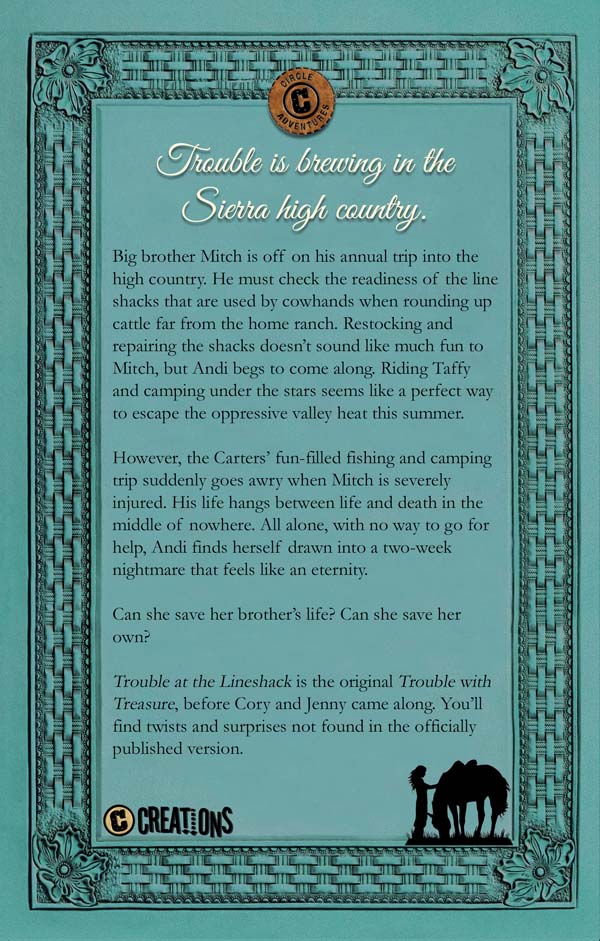
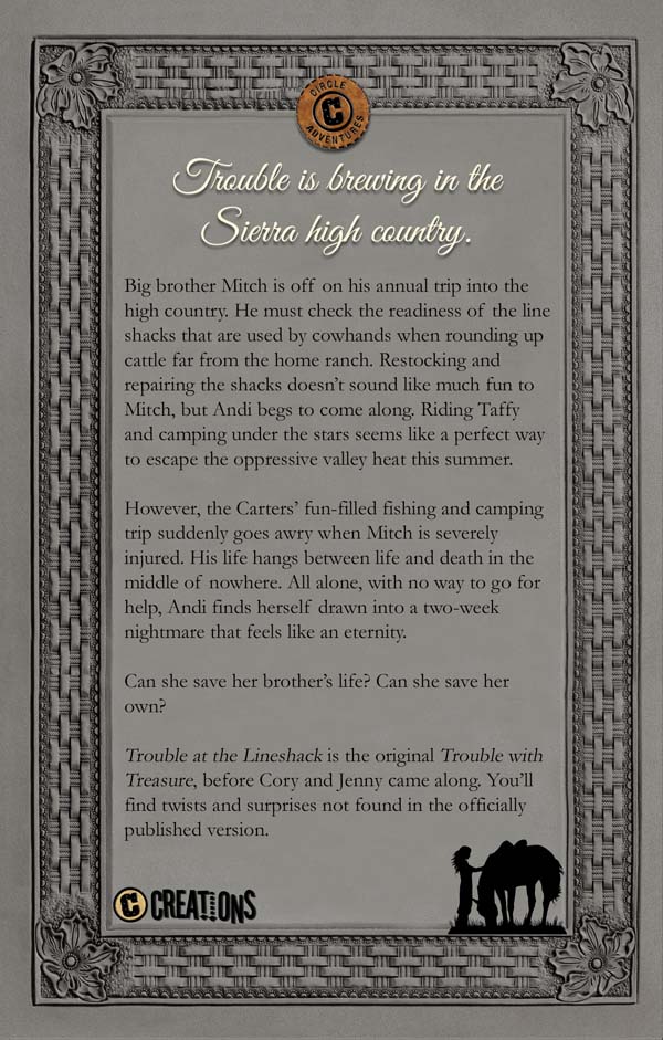
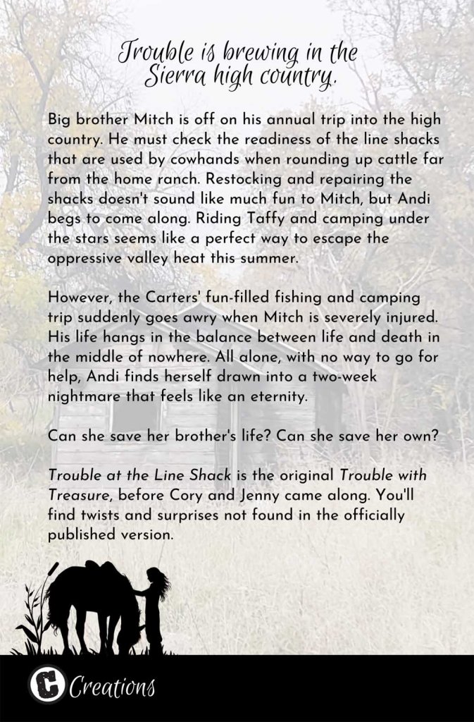
Let me know in the comments which cover version you prefer–1 (green), 2 (gray), or 3 (something different)–and why. Oh, and if you find any typos in the back cover text, please let me know!
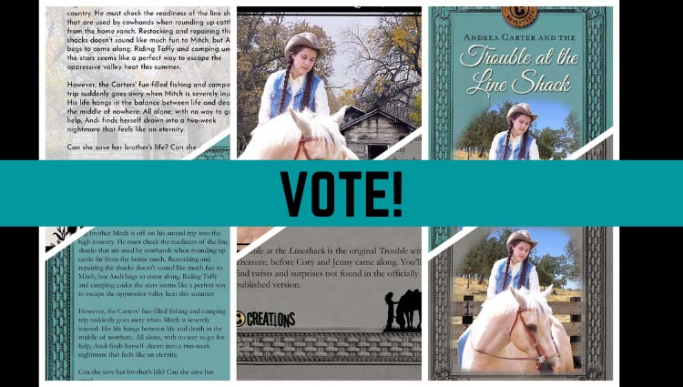
Cover spread #1 – Dark Turquoise

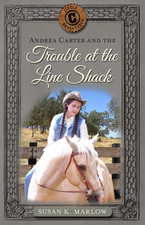
Cover spread #2 – Gray
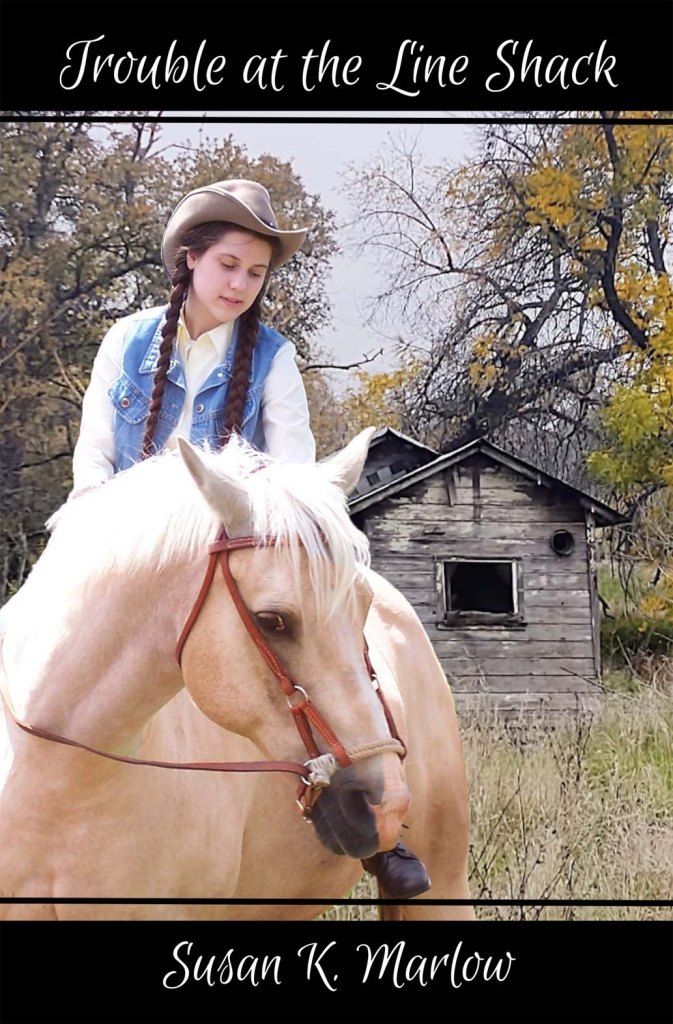
Cover #3 – Something Different
Have fun and thanks a bunch!


I really like green the best! Mostly bc it’s my favorite color 🙂 but also bc looks really good with the color of Andi’s hair and Taffy’s coat!
LikeLiked by 1 person
I also think # 1, green, looks the best, although # 3 is different and cool.
LikeLiked by 1 person
Oh yay! I think I like #1, the dark turquoise, the best : )
LikeLiked by 1 person
#1 dark turquoise
LikeLiked by 1 person
I like the first one the best! the color is awesome!!
LikeLiked by 2 people
I like the #3-something different the best. It’s very unique and gives the books a different look. Maybe for all of the short story books use it for that to give them a different look? This cover helps give more focus on Andi and Taffy.
#1 and #2 are also pretty and look good, but I would have to say #3 is my favorite.
Thank you for letting the fans help pick the covers!!
LikeLiked by 2 people
Also in #3 the picture is clearer and you can see the “line shack” which helps visualize the book more.
LikeLiked by 1 person
I agree. #3 gets my vote 😉
LikeLike
I agree, since its a special book I think you should go with #2 😊
LikeLiked by 1 person
The gray cover? Or do you mean number 3?
LikeLiked by 1 person
Grey cover #2
LikeLike
#1!! Why? Because
It’s my fav color and it’s Andi unique for a book cover 🙃
LikeLiked by 1 person
I meant ‘also’ not Andi
LikeLiked by 2 people
I really like option #1 the best. I also like option #3 as well, but #1 is the best in my opinion.
That is super exciting about Terrible Secret. It has long been my favorite of the lost stories, I can’t wait to read the ending.
Thanks for letting us vote on the covers!
~Anna Elizabeth
LikeLiked by 1 person
I like number 1. the green one or the something different one number 3.!!
LikeLiked by 1 person
I like #1 or #3 best
LikeLiked by 1 person
#1. Because I love that color and it is very unique 😊
LikeLike
#1. 🙂
LikeLiked by 1 person
I like #3 best. It’s unique and brighter than the others, in my opinion.
LikeLiked by 1 person
I like #1 green the best for sure!!😁
LikeLiked by 1 person
I think the green covern(#1) is the best, though #3 is different and i like the shack in the backround.
LikeLiked by 1 person
#3😃
LikeLiked by 1 person
They all look amazing, but I would have to choose #1 the colour looks so nice with the picture.
LikeLiked by 1 person
I think #3 looks the nicest and will best represent the book because you can see the shack in the background. Also, because it is so different, you can tell right away that it is not an original book from the series and is quite special. I also like on the back of the cover, while the C Creations thing and the girl and horse kind of seem out of place on the first two, on #3 it blends in and looks really nice. In addition, I also think that the font on the back of the cover of the last one looks better than the first two. You can also see Andi and Taffy better in the last one because it is enlarged bigger than Turquoise #1 and Grey #2.
LikeLiked by 3 people
You should do #3. It just says Andi!
LikeLiked by 1 person
I just looked at #3 to see if it just says Andi for the title lol
LikeLike
#3 is my favorite
LikeLiked by 1 person
This is so exciting!
I like #1 the best!
LikeLiked by 2 people
I like #1
LikeLiked by 1 person
I like#3
LikeLiked by 1 person
Love the green (1) cover! I think the 3 one is pretty cool too though!! I hope to read this one and Andrea Carter and the Terrible Secret!
LikeLiked by 1 person
I like the back ground on #3 but I like the color on #1
LikeLiked by 1 person
I like #3 best, you can see the entire picture, and it helps you to imagine it better when reading the book.
LikeLiked by 1 person
(I mean you can imagine it better because you can actually see the entire picture, woods, shack, -etc.)
LikeLiked by 1 person
Oh! Three is cool, but definitely do #1!
LikeLiked by 1 person
OOOO! This is hard. I’d either say #1, or #3. Number one is such a pretty color, and it really enhances Taffy’s golden coat! But number three you can see the line shack, and it goes well with Taffy’s coat also. It also does stand out from the other books! *Takes deep breath* (I feel like the sorting hat for Hogwarts!) I’d have to say- NUMBER THREE!!!
LikeLiked by 1 person
I think #1 goes the best with Andi and Taffy! (It’s also one of my fav colors! Thanks for asking) so excited for it and the other book I hope you print!!
LikeLiked by 1 person
Green!!
LikeLiked by 1 person
#1 all the way!
LikeLiked by 1 person
1# or 2# I like them both!
LikeLiked by 1 person
How fun! I like the first one, the dark turquoise 🙂
LikeLike
I like 3#, it just says Andi!
LikeLike
Mrs. M, when will the cover that is chosen be announced?
LikeLike
Oh, when I get some time next week. I have spring story contest entries to organize first! I’m getting a lot of entries….
LikeLike
Definitely #2!!!!!!!!!!
LikeLike
The gray one?
LikeLike
2 because turquoise is my favorite color
LikeLike
#2 is the gray one. 😋
LikeLike
Oops 😳then I mean 1
LikeLiked by 1 person
I love #1 if this book was gonna be another story all together to add to the series (you know, not a different version of one of the books already in the series), but in this case, for your additional stories, I think it’d be cool to go with a different look, #3.
LikeLike
What if you did #1 with the picture from #3?
LikeLike
I did. I used the same Andi and Taffy. There isn’t room in the #1 cover to put anything more than that. No room for the shack…
LikeLike
I could try to manipulate the shed picture to make it fit on #1…..
LikeLike
Ok
LikeLike
I’m torn between #1 and #3… I think if #1 had the shack on it, it’d definitely be my favorite. However, if #3 had teal instead of black borders, I think it’d also be really, really close. I LOVE the teal, and I guess I’d have to vote for #1, because it has the teal, yes, but also because the extended Long Ride Home has the same sort of design and it would seem a bit more like they belong together. Is there any chance you could put the shack in the picture for #1?
Thank you for letting us vote! It’s such fun to see some of the Andi books on my shelf and be able to think “I got to help with that!” You’re a really cool author. = )
LikeLiked by 2 people
It’s a possibility. I’ll when on it when I get home from the homeschool convention this weekend.
LikeLike
I think #1! I think the color will go the best with the rest of the Adventures books.
LikeLike
Turquoise all the way!!!
LikeLike
I like either #1 or #3. The turquoise in 1 is pretty and goes with the picture. No. 3 is unusual and catches your eye as to what trouble Andi has gotten herself into now.
LikeLiked by 1 person
3 really caught my eye 1 is cool to but I say 3
LikeLike
It’s So Hard to Chose! I Like #1 and #3!
I Love the green colour on #1 but the shack on #3 is really… Um…I Just like it!!!
So I think You Should do #1 or #3!
LikeLiked by 1 person
I think that #3 is my favorite… Just because of the very unique colors, but most of all, I like the shack in the background! I think it adds an intriguing layer to the title. All three are great though- you couldn’t choose wrong! 🙂
LikeLike
# 3 all the way
LikeLike